Have you ever wondered why some designs are instantly etched in our minds, while others are quickly forgotten? The secret to this permanence often lies in the subtle details that may not be apparent at first glance, but subconsciously affect our perception and feeling. One of these crucial details is choosing the best font. Choosing the best font can be the difference between an ordinary design and a visual masterpiece. In this article, we will take a deeper look at why fonts are important, introduce the main categories of fonts, and finally introduce a selection of the best font so that you can make a more confident choice. So join us as we journey towards understanding the best fonts that can take your design to the top.
What is a font?
A font is a set of specially designed letters, numbers, and symbols used to represent written language. In essence, choosing the best font means selecting a digital version of a typeface that is the right size, weight (such as bold or regular), and style (such as italic) to effectively convey your message.
The best Farsi font
In this section, we will introduce 7 examples of the best Persian fonts to help you choose the best and most appropriate font for your various projects.
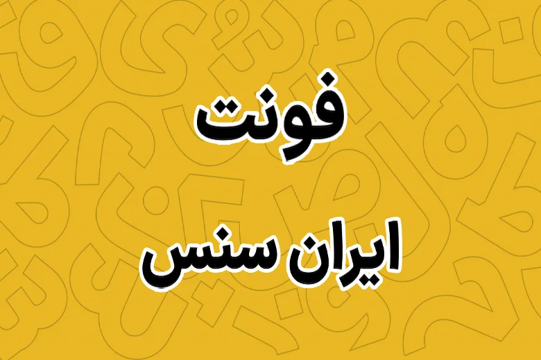
Iran Sans
Features: Iran Sans is a font that is compatible with long texts and offers high readability with a modern and semi-bright design. Its relatively appropriate letter height, character spacing, and weight balance make it easy to read long texts without fatigue. Applications: Suitable for brochures and catalogs, long website texts, small book designs, and Persian academic papers.
Reasons for popularity: High readability in long texts and coordination with different color palettes. Iran Sans goes well with minimal and professional designs and is considered a standard font for many brands.
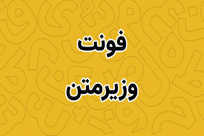
Vazir
Features: With its strong structure and easy-to-read lines, Vazir conveys a sense of stability and professionalism. The design is classic yet modern, adding a level of formality to the text. Uses: Office set design, classic logos, formal brochures, professional event posters.
Reasons for popularity: Balance between resistance to small spacing and readability at different sizes. Suitable for long texts and short titles that require visual stability.
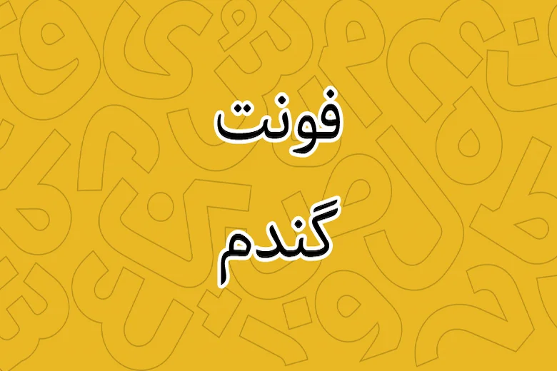
Gandom
Features: With its soft and light lines, Gandom conveys a friendly and human feeling. At the same time, with its good readability at different sizes, it is a popular font for contemporary designs. Applications: User interface design, Persian-language familiar websites, lightweight logos, light brochures.
Reasons for popularity: Playful fit with modern designs and quick response to audience focus. Suitable for brands with a warm and friendly personality.
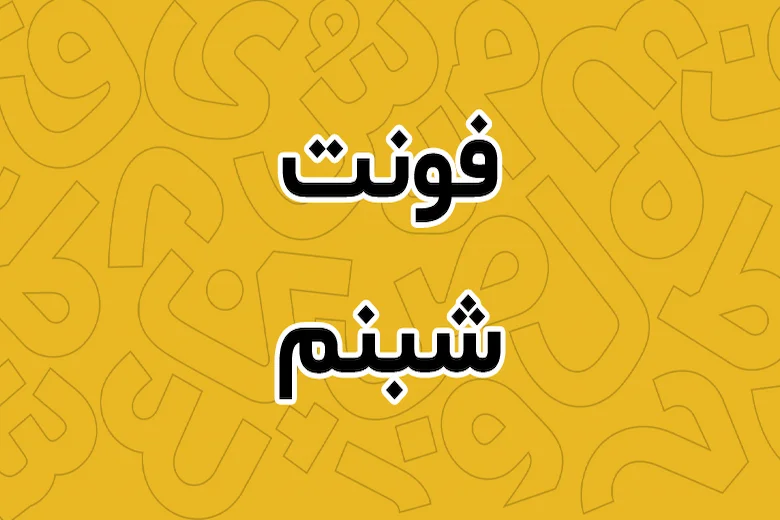
Shabnam
Features: Shabnam, with its unique lines and open proportions, conveys a sense of calm and elegance to the audience. It is suitable for large titles, especially in print and digital work. Applications: Banner and poster design, short titles on websites, artistic packaging.
Reasons for popularity: Clear characters in large sizes and good readability in small sizes. Suitable for artistic brands or cultural events.
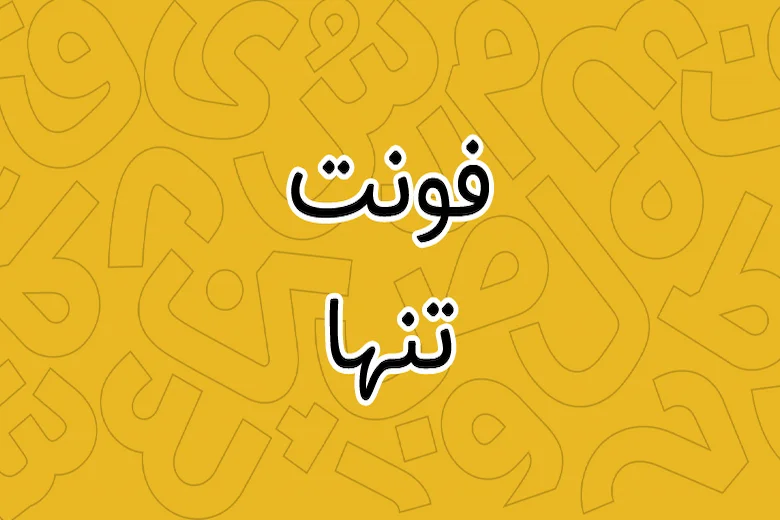
Tanha
Features: Tanha is a simple, strong-character font that rarely loses its ability to adapt to any context. Clean, crisp lines. Uses: Simple logo designs, modern office suites, corporate websites.
Reasons for popularity: Highly compatible with a variety of color palettes and can be used in a variety of sizes. Good for brands looking for a clear, unobtrusive message.
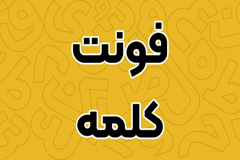
Kalameh
Features: With a bold approach and simple structure, Kalameh is highly legible and suitable as a logo font or for long texts. Uses: Logo design, advertising banners, clear and simple brochures.
Reasons for popularity: Balance between personality and calm. Suitable for brands that want to convey both a clear expression and a friendly feel.
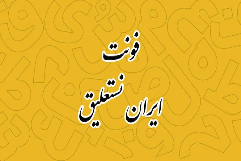
Nastaaliq
Features: Nastaaliq is a strict style with emotion and history that can convey a sense of Iranian authenticity and art. If Nastaaliq is combined with a modern alternative, it can create extraordinary appeal. Applications: Designing cultural posters, special logos, books with historical or literary content. Especially if placed next to the best modern font, it will create a unique combination that displays both authenticity and innovation. Choosing the best modern font in this combination requires precision and taste to ensure that contrast and harmony are well combined.
Reasons for popularity: Strong cultural identity and the ability to create a deep sense of art in the design. Use with certain restrictions and combination with other fonts is appropriate to create balance.
Note: To choose the best Persian font, it is important to pay attention to the stretch of the text, the level of formality, and the coexistence with other design elements. Combining several fonts together can also help create visual hierarchy.
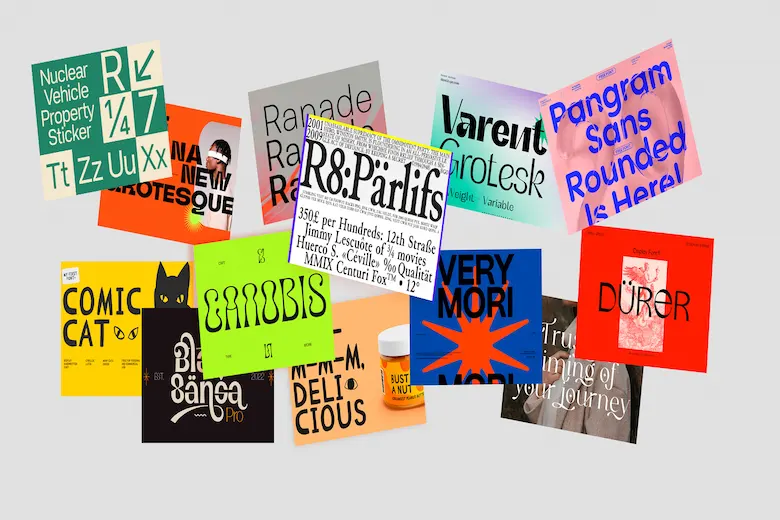
Best English font
In this section, we will introduce 7 examples of the best English fonts to help you choose the best and most appropriate font for your various projects.
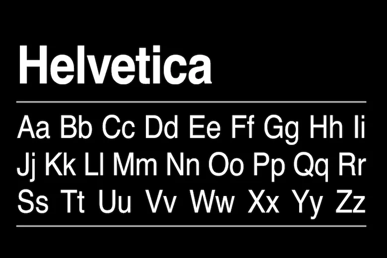
Helvetica
Features: Helvetica is one of the most classic and widely used sans-serif fonts. Clean, simple, and toothless lines, with no unnecessary embellishments.
Uses: Logo design, minimal website design, technical brochures, office and presentation design.
Reasons for popularity: Reader-friendly, cross-platform integration, and ability to work at different sizes. Professional and international designs work well with Helvetica.
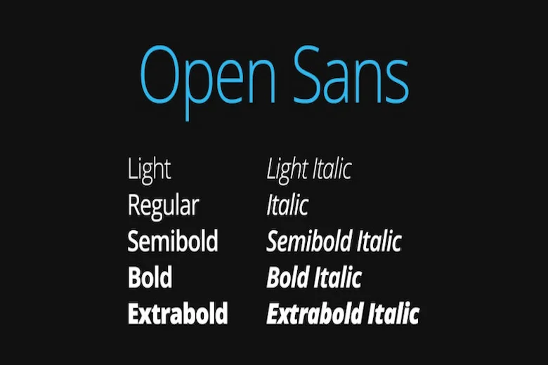
Open Sans
Features: Open Sans is a friendly design with high readability on the web and in print, easily fits into long text lists. Uses: Websites, apps, user interfaces, brochures, and digital catalogs.
Reasons for popularity: High flexibility for translation and multilingual content, and a number of different weights to create visual hierarchy.
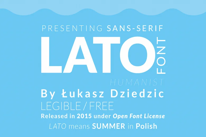
Lato
Features: With a combination of precise geometry and soft lines, Lato has a special place in modern and professional designs.
Uses: Business websites, apps, brochures, user interfaces.
Reasons for popularity: Balance between human touch and professionalism, suitable for textual content and short titles.
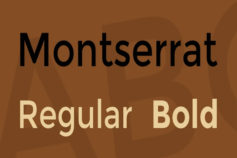
Montserrat
Features: Inspired by urban architecture and urbanism, Montserrat offers a substantial weight and height of typefaces.
Uses: Large headlines, advertising banners, modern website design, and posters.
Reasons for popularity: The variety of weights allows for strong hierarchy and reinforces a modern, urban feel.
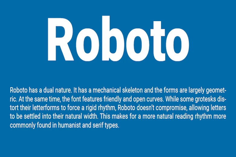
Roboto
Features: Combining compact geometry with human-like execution, Roboto is ideal for user interfaces and long texts.
Uses: UI design, websites, apps, brochures.
Reasons for popularity: Wide ecosystem support, especially in Google technologies, and compatibility with various display systems.
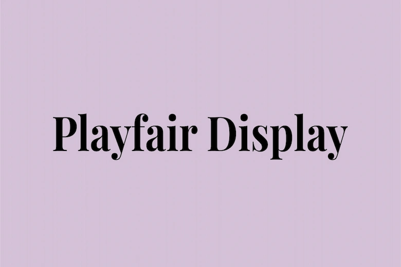
Playfair Display
Features: Playfair Display is a serif font with a classic presence and a bookish feel. It is suitable for large titles and special content.
Uses: Magazine articles, fantasy or literary brochures, header designs.
Reasons for popularity: Creates a sense of tradition and value in the text along with a readable artistic beauty.
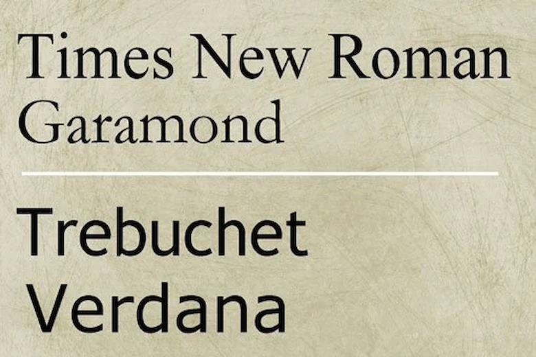
Times New Roman
Features: Times New Roman is an old and familiar classic that is suitable for scientific articles, long reports or news texts.
Applications: Educational books, scientific articles, official reports.
Reasons for popularity: Reputation and compatibility with printed and digital documents, no ambiguity in long prints.
Note: For diverse and international designs, using several English fonts alongside a Persian palette can lead to creating an eye-catching and diverse combination. Choosing the best font for this purpose plays an important role in conveying the desired mood. Also, when designing multilingual logos or brands, attention should be paid to the coordination between Persian and English fonts to maintain visual integrity and to make the best font appear well in both languages.
The importance of choosing the best font in design
Choosing the right font in design has a significant impact on readability, message delivery, and the audience’s understanding of the brand identity. In graphic design, fonts play a key role in conveying the message and creating a visual identity. Choosing the best font not only helps the design look beautiful, but also improves the user experience. In logo design, the font not only identifies the brand name, but also defines the brand’s personality. In office set design, fonts create continuity and consistency so that the audience can quickly connect with the brand.
In banner and poster design, the right font can convey the message to the audience with high clarity, and in brochure and catalog design, it facilitates readability and information navigation. And in website design, font selection affects the user experience: reading speed, focus on content, and a sense of professionalism or discomfort with a user interface all play a role.
Tips for choosing the right font
Choosing the right font in a design has a significant impact on readability, message delivery, and the audience’s understanding of the brand identity. In graphic design, fonts play a key role in conveying the message and creating a visual identity. Choosing the best font not only helps the design look beautiful, but also improves the user experience. In logo design, the font not only identifies the brand name, but also defines the brand’s personality. In office stationery design, fonts create continuity and consistency so that the audience can quickly connect with the brand.
• Readability:
A legible font makes it easier for the reader to recognize words, follow sentences, and better understand the content of the text. Choosing the best legible font is a fundamental step in design that respects the audience and provides them with a positive experience.
• Brand coordination:
A good font should reflect your brand identity; it should accurately portray the authenticity and message you want to convey to your audience. In fact, the best font is not only legible, but also acts as a powerful visual element that conveys your brand identity in a coherent and effective way.
• Project objective:
The chosen font should be in line with the project’s purpose and be consistent with the “why” of the project and “who it is for.”
• Font simplicity:
By avoiding visual complexity, optimizing readability, and reducing eye strain, simple and legible fonts provide a suitable platform for effective message transmission and create a professional and user-friendly experience. In other words, simplicity in fonts is the key to effectiveness. When choosing the best font, simplicity and legibility should be prioritized so that the message is conveyed correctly.
• Number of fonts:
Using too many different fonts in a project can reduce readability, create confusion, and lack of coherence in the design. This is because the reader may have difficulty distinguishing between the main and secondary fonts, making the text difficult to read. Also, too much contrast between fonts can be distracting and reduce the reader’s focus. To avoid these problems, it is essential to choose the best font and limit the number of fonts in a project.
• Contrast:
Using the right contrast between the font and the background color in your design makes the text easy to read and prevents eye strain. Therefore, choosing the best font with the right contrast in mind is a crucial aspect of design that helps improve the user experience.
Final Words
Choosing the best font is more than just a design decision; it is an artistic-scientific process that requires knowledge of design principles and a deep understanding of the project’s purpose. Quality training, usability testing, and audience feedback will guide you in finding the best font. Avoid limitations and experiment with different combinations, appropriate sizes, line lengths, and color combinations to create a better user experience and introduce your brand to your audience in an accurate and reliable way. As a final point, consider the roots of design with every project you start: fonts are your language, but only by understanding the principles of design can they become a powerful tool in your hands. Thank you for your support.
Amood Design and Branding Group specializes in office set design, banner and poster design, brochure and catalog design, logo design, business card design, website design, and more. Dear friends, you can contact us through communication bridges for more information and free consultation.