

Typography, this ancient art, is more than just the arrangement of letters on the page, it means bringing words to life and conveying the concepts, emotions and identity of a message. Typography is a visual language that, by carefully choosing the form, size and arrangement of letters, is able to create a unique experience for the audience. From books and magazines to websites and mobile applications, traces of this art can be found everywhere. In depth, typography is the key to success in any design project, as it has a direct impact on the readability, attractiveness and even the overall effectiveness of the message. This article explores the wonderful world of typography and sheds light on its different dimensions, so stay tuned.
What is typography?
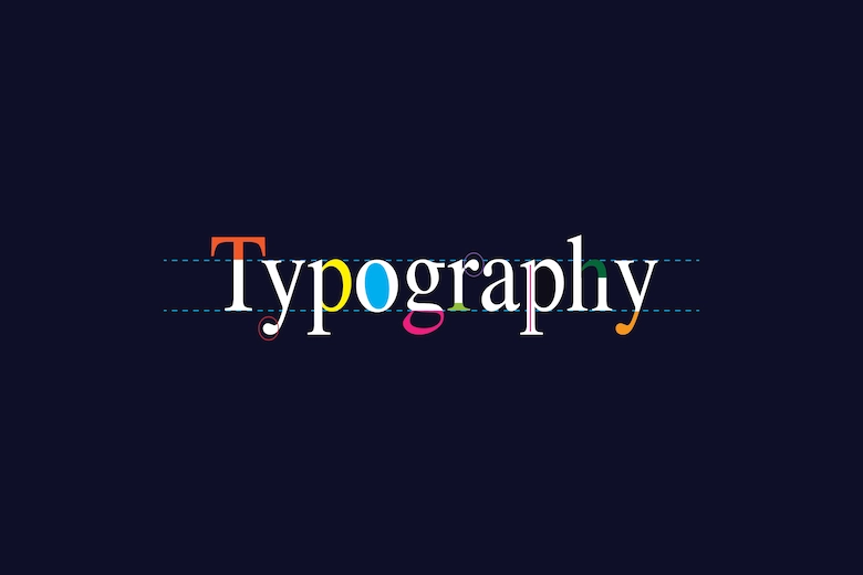
Typography, which has its roots in the arts of typesetting and printing, is the science and art of arranging letters, words, and text in a way that maximizes readability, comprehensibility, and aesthetics. This art is not limited to choosing a beautiful font, but includes all visual aspects of text, including font size, line spacing (leading), letter spacing (kerning), word spacing, text alignment, and visual hierarchy. The main goal of typography is to effectively convey a message to an audience in a way that is both visually pleasing and informative.
History of typography
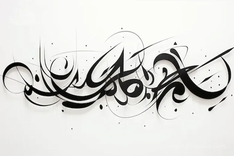
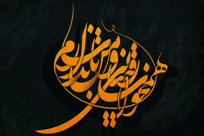
The history of typography has a long and eventful story, starting with the early inventions of calligraphy and calligraphy and gaining momentum with the invention of the Gutenberg printing press in the 15th century. Before Gutenberg, books were written by hand in calligraphy, a time-consuming and expensive process. The invention of movable type revolutionized the dissemination and access to knowledge and laid the foundation for modern typography. Over the following centuries, we saw advances in printing techniques, type design, and the emergence of different typographic styles.
From the handwritten fonts of the Middle Ages to the Gothic fonts and then the Roman fonts that became popular during the Renaissance, each era reflected the culture and social needs of its time. This evolution highlights the importance of typography as a tool for transmitting culture and information. In this regard, office set design and brochure and catalog design have also evolved over time and today play a vital role in the visual identity of any organization.
Key Elements in Typography
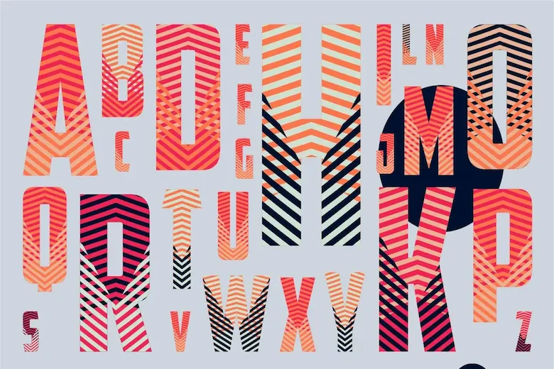
To create a work of art in typography, it is essential to understand and master its key elements. Among these, the font or typeface is the main building block, which itself includes a family of different designs (such as different weights: thin, regular, bold, italic). Font size is crucial for legibility and creating visual hierarchy. Line spacing or leading adjusts the vertical space between lines of text and directly affects the readability of the text, with less spacing making it more difficult to read and more spacing making it easier.
Kerning is the adjustment of the spacing between certain pairs of letters that visually overlap (such as AV) and kerning is the uniform spacing between all the letters of a word or phrase. These elements are essential tools in every typographic designer’s toolbox, ultimately leading to the creation of a unique and impactful logo design.
The importance of typography in design
The importance of typography in design goes beyond aesthetics, but is a powerful tool for conveying a message, creating an identity, and influencing an audience. A good design with appropriate typography can immediately grab the attention of the audience, effectively convey information, and inspire a desired mood such as seriousness, playfulness, luxury, or simplicity. Poor typography, even in the most beautiful designs, can cause confusion, eye fatigue, and ultimately the failure of the message. In designing a brand’s visual identity, the right choice of font and how to use it plays a key role in shaping the personality and values of the brand.
Typography on the web and digital media
In the digital age, typography has taken on a new role. Websites, apps, and social media all rely heavily on typography for user experience (UX) and user interface (UI). In the digital environment, new challenges arise for typography, including legibility on different screens with different resolutions, optimizing the loading speed of web pages, and impacting user interactions. The use of web fonts and responsive typography techniques that allow text layouts to adapt to different screen sizes are essential principles in digital design. Choosing the right typography in this space directly impacts user satisfaction, conversion rates, and the success of a digital product, and plays a vital role in website design.
Choosing the right font
Choosing the right font is one of the most important and challenging aspects of typography. Each font has its own unique personality and can convey a specific mood. Serif fonts, with their small squiggles at the end of the letters, usually convey a sense of tradition, authority, and formality and are more suitable for long texts in articles and books. Sans-serif fonts, which lack these squiggles, convey a sense of modernity, simplicity, and minimalism and are very popular for titles, websites, and user interfaces.
Script fonts resemble handwriting and convey a sense of elegance, creativity, and intimacy, but they should be used with caution and in appropriate sizes. Understanding the purpose of the project, the audience, and the intended message is the main guide in choosing the right font in the world of typography. Especially when designing a business card where there is limited space to convey a message.
Principles of readability and clarity in typography
Readability and legibility are two fundamental and vital principles in the art of typography that are often confused, but each refers to a different aspect of the visual experience of text. Readability refers to the ease of understanding text as a whole, that is, how easily we can read a paragraph or page without straining our eyes. This is affected by factors such as font size, line spacing, line length, and contrast between text and background. Clarity refers to the ease of distinguishing individual letters and words. That is, how easily we can distinguish each letter from another.
This is largely dependent on the design of the font itself, including the shape of the letters, the thickness of the lines, and the distinction between similar letters. Careful attention to these principles in typography is key to successful information transmission, and is especially crucial in banner and poster design, which must convey a message to the audience at a glance.
Color Psychology and Its Relationship to Typography
Colors are the most powerful tools for evoking emotions and creating connections in the visual world, and along with typography, they have a tremendous impact on messaging. The choice of background color, text color, and even decorative colors next to type can significantly affect the audience’s perception and response to content. For example: blue often conveys a sense of trust, calm, and professionalism, while red can evoke a sense of excitement, urgency, or danger. Green symbolizes nature, growth, and health, and yellow attracts optimism and attention.
The right combination of color with typography not only helps with readability, but can also enhance the message and convey the desired emotions more effectively. This synergy between color and typography is an essential tool in the hands of designers, especially in brochure and catalog design, where an attractive combination of visual and information can easily attract the audience.
The future of typography and new trends
The future of typography is full of innovations and trends that are shaped by technological advancements and cultural changes. We are witnessing the continuous emergence of new fonts with bold designs and creative applications. Animation and motion graphics in typography, especially in digital media, are increasingly popular and bring text to life. Artificial intelligence is also entering the field of typography, offering tools to automatically generate type designs or optimize text layout. Also, attention to accessibility in typography will be more important, especially for people with disabilities. Typographic design is a dynamic and evolving space that is accompanied by creativity and technology and is constantly redefining itself.
Final Words
At the end of this exploration into the world of typography, we can conclude that this art is more than just an aesthetic choice, it is a vital backbone in any effective visual communication. From its rich history to its complex elements and profound impact on the user experience in the digital world, typography has always played a central role in conveying messages, shaping identities and evoking emotions. Smart font selection, attention to the principles of readability and clarity, and a correct understanding of color psychology, along with skillful arrangement of letters, all work hand in hand to create a lasting work. With future trends and innovations, the importance of typography will continue to grow, and mastering this art will remain essential for anyone seeking to create impactful visual experiences.